Does your e-commerce site give visitors the power to shop on the go? Now days, online shoppers arent just shopping from desktops, the mobile movement is changing consumer behavior around the world! According to comScore, 55% of time spent with online retail in June 2013 occurred on a mobile device.
100% of online stores will need a mobile and tablet version in 2014. Why? E-business owners that havent optimized their sites are already losing sales today.
What does it mean to have a mobile friendly site?
Its essentially a version of your site that loads quickly and is easy to navigate on a mobile phone or tablet device. Consumers are impatient so they wont wait if your site takes too long to load or if its too complicated to browse.
Your online shop should adapt to whatever device visitors are browsing on but thats not all! You need to take into account the small screens and how you can effectively convert visitors into purchasing customers.
The design of your mobile optimized online store
To overcome the challenges that a mobile site design poses, there are several factors to consider to make your online shop user-friendly and capable of converting visitors.
Swift Navigation
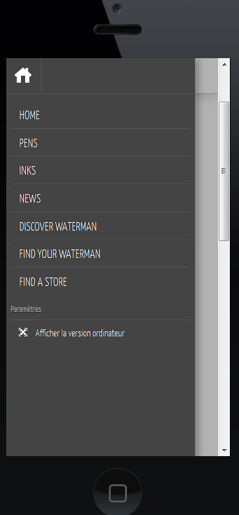
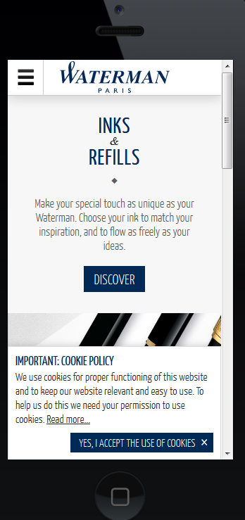
The navigation on the mobile version of your site should be optimized for touchscreen interfaces. That means your buttons should be bigger with more spaces in between links. Its almost impossible to click on a tiny link with your finger without having to zoom in.
To optimize navigation, stick to one way scrolling to eliminate the visitors frustration of having to scroll in multiple directions just to find what they are looking for. Youll also want to avoid pop-ups and new windows since it can interfere with the shopping experience.
Waterman Mobile Version


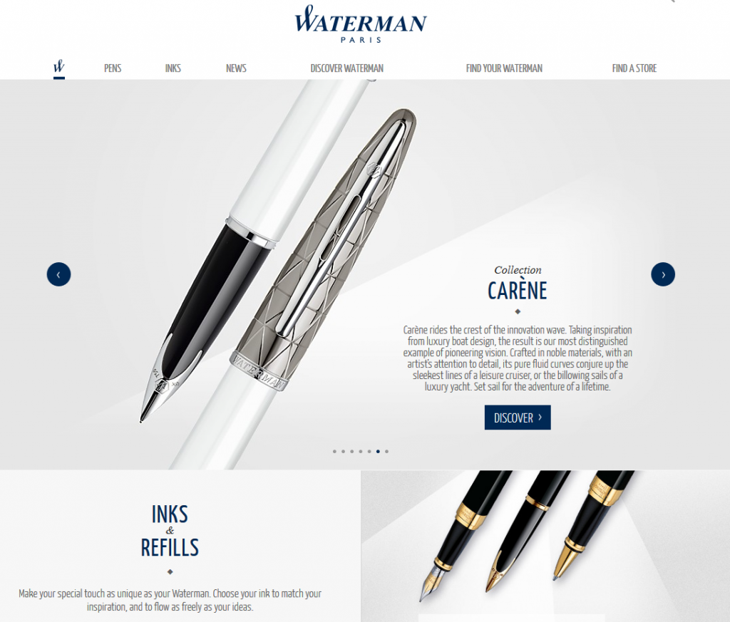
Waterman Desktop Version

Simplify Content
For the most part, your mobile site should be lighter in content than your standard site. You want to prioritize whats most important on the site and try to remove ads if possible. Limit your menu options, links, text and images so that youre mobile site isnt cluttered and overwhelming.
Remember, youre not working with a lot of space and you dont want your site to have endless scrolling or make visitors go through more than 2 steps to get to what theyre looking for. Keep it basic.
Optimize the Checkout Process
Abandoned carts are a huge issue for e-commerce sites on desktops so imagine what that means for mobile devices. One of the biggest contributions to abandoned carts is a difficult checkout process with too many steps. Your mobile site should make it super simple and fast for purchasers to check out.
ARTICLE SOURCE http://bit.ly/1de9kDu : This factual content has not been modified from the source. This content is syndicated news that can be used for your research, and we hope that it can help your productivity. This content is strictly for educational purposes and is not made for any kind of commercial purposes of this blog.