Is Your e-Commerce Website Cleanly Designed?
Building an ecommerce site that customers love largely comes down to two things: sweating (and testing) the small stuff, and understanding human psychology.
How do people view, browse, and use your site? While testing will be the final judgement for what works on your site, conversion studies can be a great place to begin when designing your site.
Today I'd like to go over five big ecommerce design mistakes that I commonly notice on far too many of the shops that I visit.
Be sure to take careful note if your site is making any of the following mistakes, and try implementing A/B tests with my corrections; I have a hunch you'll see a noticeable change in your bottom line!
1. Lack of a Clear Value Proposition
Your value proposition is the #1 thing that determines whether people will bother reading more about your product or hit the back button. If I could give you only one piece of conversion advice, test your value proposition would be it.
A strong value proposition is your argument as to why customers should buy from you when they could buy from the competition. This is especially important for ecommerce, because why should customers buy from you when they could buy from Amazon?
Unfortunately, not only do many ecommerce sites have poor value propositions, but many sites even have difficulty communicating exactly what they sell! I don't mean to pick on Yummy Tummy a great soup and baked goods companybut landing on their site is one of the more confusing experiences I've had online:
What exactly am I buying here? If I can't figure it out soon, I'm likely to leave.
Compare that with sites that have excellent value propositions, such as Wolverine Boots:
Example above makes a great used of images in their value propositions. Although clear, concise copy is very important for every website, remember that images can also tell a story about a product. As legendary advertiser Claude Hopkins would say:
Use pictures only to attract those who may profit you. Use them only when they form a better selling argument than the same amount of space set in type.
The essential elements of any good value proposition include the following items:
A headline (possibly with subheadings) that uses simple, clear language as to why an item is worth purchasing. It's not a slogan, it's a promise of value, such as "Create a professional client proposal in minutes.
Body copy explaining why buying this item from you is the best choice. What do you have to offer that others don't? Why are you different?
Additional benefits and social proof (elements like free shipping and guarantees).
Images that create desire by showcasing the item in use.
When people understand what they are buying, and why they should buy it from you, I guarantee that your site will see an increase in sales over a design that doesn't communicate clearly with customers. People often don't know why they might need your product until you tell them ("You'll love our newest product because..."), so don't be afraid to be direct and crystal clear.
2. Misguided Product Descriptions
We all know that product description can be extremely important, but oftentimes ecommerce store owners include or remove them at abandon.
As it turns out, these descriptions mean different things when you are selling different products. Check out the study conducted by the Nielsen Group below:
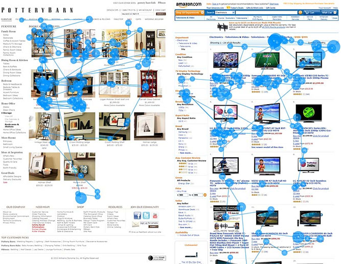
Here's what they found:
Thumbnails of bookcases were studied intensely, whereas thumbnails of flat-panel TVs were mainly ignored. In fact, on the full Amazon page, only 18% of the viewing time was spent on the photos, while 82% was spent on the text.
The comparison was between bookshelves and shelving on the Pottery Barn website, and TV listings on Amazon. When you think about it, the difference in the products is quite clear: most people buying a bookshelf care about how it will look in their room. Most people buying a TV do care somewhat about how it looks, but are mostly concerned with the specs (how big, Plasma or LCD, is it a smart TV?, etc.)
As the Nielsen write-up would so humorously point out:
The TV photos are of no help in deciding between the products. A guy in a canoe vs. a football player? What, because I watch more football than water sports, Ill buy the TV showing a football player?
That's in contrast to a bookshelf, where cherry colored vs. oak colored matters. You can incorporate this information into how you handle product descriptions by really thinking about your product and how your customer shops for it.
Do they care mostly about how it looks, or about what it's capable of? Adjust your image use and product descriptions based on this need, and you'll have far more informed and happy shoppers.
3. Failing to Properly Utilize Quality Images
If you happen to sell items that are mostly dependent on looks (like the Pottery Barn example above), you should know by now that the visuals that you use are incredibly important.
In fact, one case study from Visual Website Optimizer showcased how an increase in ecommerce image size improved conversions by a notable amount:
4.) No Visual Hierarchy or Attention to Fitt's Law
You don't need to be a web designer to understand the importance of a visual hierarchy. One of the better images I've seen that clearly showcases how one should work comes from Josh Byers of StudioPress:
With a visual hierarchy in place, it's easy to navigate a website because actions begin to become recognizable due to the site's design. It becomes apparent that all accent colored text is a clickable link, and that base text is unclickable, used only to complement the site's overall background color.
One part of this hierarchy is the use of Fitt's law. In essence, the law states that eyes are drawn to larger items which makes them more clickable (duh). Therefore, important elements should be made larger and stand out from the rest of the page.
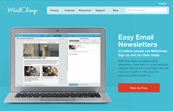
Color accents can also be used here, such as how the old MailChimp site used to offset their blue background with a red button:
Why is Fitt's law important?
5. The Site Doesn't Look Trustworthy
When competing against the big boys of ecommerce, there is one thing you need to realize: their brand recognition means that they don't have to prove to people that they are trustworthy.
Just because you are trustworthy does not mean customers will believe you.
Your site has to reflect your willingness, ability and track record for delivering on your promises. As Derek Halpern first revealed, an interesting study done on the trustworthiness of health sites found that the design of the site played more of a role than the actual content of the site.
So how can you make your site appear more trustworthy? You need to take a customer focused approach heretoo many companies offer up social proof in a way that seems like chest bumping, instead of thinking about the psychology behind why a potential customer might be worried about shopping via an online store they've never used before.
Instead, really think about what worries a customer might have when shopping from an unkown store, and structure your social proof to address these issues. Here are a few of my favorite elements to utilize:
Customer Testimonials
The perfect testimonial is typically found through a well known customer, or a customer that perfectly represents one of your personas. In other words, the source of the testimonial often matters just as much as what was said, so put your best foot forward by selecting the praise you received that will be most comforting to prospective customers.
An Up to Date Design
You aren't required to hire a world class designer to launch your bootstrapped ecommerce business, but just know that people do judge books buy their cover, and will judge your business by your site's design. Avoid trends, but make sure your site looks up to date and cleanly designed.
Always Be Testing
The final thought I'd like to leave you with when it comes to your ecommerce store design is that at a certain level, testing should become an ongoing process.
TRY SHOPPING CART ELITE TODAY!