|
Blocks Editor OverviewThe "Blocks Editor" is Shopping Cart Elite's Drag and Drop Editor that is both powerful and easy to use. The editor is an easy way to make visually impressive pages even if you have no website design experience. The Blocks Editor screen when opened in your browser has several important sections. The top panel where you can Save your work among other settings. There are two side menu panels, the left side menu for adding elements to the page and the right side menu that dynamically changes depending on the available options for the element you are editing.
Quick Note:Click the Lock Icon (right of "Parent Layout" on the Settings Panel to lock the layout you are currently editing. It's a good way to "Finalize" or otherwise protect your work from being wrongly configured.LayoutsThe layouts block is the essential backbone of your content and all other blocks will be added inside it. Each "Layout" has several options: - Publish: This controls the visibility of your Layout. Set it to "Off" to hide your layout.
- Devices: You can set your Layout to appear on Desktop Devices, Mobile Devices, or both Desktop and Mobile Devices.
- Responsive: When turned on it makes your Layout responsive - adjust to the width of the page.
- Render Wide: Adjust this when you need your layout to take 100% of the width of it's parent.
- Render Narrow: This setting will make the layout be narrow (850PX Wide)
- Featured: Brings the layout to the top of the page.
- Featured Elements: Adds custom elements to your featured element.
- Match Screen Height: Turn this on for full page layouts or backgrounds that match the user screen's height
- Custom Class: Adding a Custom Class is useful for making even more customized layouts that you control with your CSS
Classes for Custom CSS in LayoutsYou can add a "Custom Class" for use in CSS to a "Layout" block by finding the option marked "Custom Class:" then entering your desired class in the textbox. Now you can apply custom styles to your layout by using the name of your custom class in your CSS. Click here For more information on how to Edit Your User CSS.
Quick Note:Your Custom Classes are not rendered in "Edit" Mode to preserve the stability of the editor. You can review your work by clicking on the "Preview" tab on the top panel.
Child Layout SettingsChild Layouts are layouts that you have added on to your main Layouts. Useful for further organizing content. Click the orange "Pencil" icon that appears on the top right of the layout to open the settings popup. There are a few options available: Grid Setup: Blocks Editor is using the 12 columns grid system. All combined columns must always equal to 12 (example: 4-4-4) Custom Class: Add a custom class for your child layout for even further customization. Layout Flexibility: "Toggle Layout on Mobile Checkbox and Small Devices" and "Toggle Layout on All Devices" Checkbox. Activates the "Toggle" or Click to Expand/Hide Layout. "Force Fixed Responsive Widths" will force the layout to have fixed responsive widths which disables "wide" layout mode Frame and Inner Padding Removal: Remove the default frame and/or inner padding of the child layout. Background Color Setting Checkboxes: You can set your child layout to have - Default, Primary, Success, Info, Warning, Danger colors. Force Text Color Checkboxes: You can force the text of your child layout to be Black or White. ElementsSpacerA Spacer block works like you expect it to when reading the name. It is used to add space in between elements but is also useful as a visual divider with "Spacer Style" setting. You have the option of adjusting the size of the space as well as the size of lines it will display. From Short Thick/Thin Line to Long Thick/Thin Line to configuring a Custom look via CSS. On the topic of spacing, blocks will often have a "Margins and Padding" setting where you can independently adjust the Top, Left, Right, and Bottom values for both Margins and Paddings.
H1 Heading, H2 Heading, and H3 HeadingThe H1, H2, and H3 heading elements are used to properly divide your content into sections. This helps readability of your content and your Search Engine Optimization.
ParagraphParagraph blocks serve as your text container. Majority of your content will likely be in Paragraphs. You can set a paragraph to be "Leading Text" by turning it on in the Component's Setting. This will make the paragraph's font size larger than the rest.
A Floating Formatting menu will appear on text type blocks during editing and includes options familiar from Word Processing software such as Bold, Italic, Underline, and others. Some settings like "Align", "Emphasis", and "Devices" are common along many elements and basically function the same. Note on Links: You can click "Link to Page" and it will open a dialog box of pages on your website that you can easily link to.
ImageAn Image block is a placeholder for your website's images. You can click the "Add Image" button to access the File Manager(where you can select files already on your webserver or upload new files). You can also paste in an Image URL then click Upload. An Image also has a few special options like: Change Image Only: Clicking this button would open the File Manager which allows you to upload or choose a new image to replace the current one Change Image & Settings: This button will reset your image element. If you only intend to replace the image, click Change Image Only. Width: Sets the width of the image element in PX or Percentage Width on Mobile in %: Sets the width of the image element on Mobile devices in Percentage Height in PX: Sets the height of the image element in PX Height on Mobile in PX: Sets the height of the image element on Mobile devices in PX Alt Tag: Sets the Alt Tag of the image element for usability. Link: Make the image a link - Add a URL here Link to Page: Clicking the Square Icon would open up the Page Selector dialog where you can easily set the image to link to an existing page on your website Target: Set your image link to Blank, Parent, Self, Top, New Open in LightBox: Set the link to appear inside a lightbox Image Edges: This sets the adjusts the edges of the image. You can set it to "Default", "Rounded", "Circle", or "Thumbnail" Align: Set the alignment of the image to Default, Left, Center, Right. LazyLoad Image: Enable or Disable the "LazyLoad" feature for this image. Text Over Image: Allows you to add Text over your Image with the following variations "Text", "Title+Text", "HTML", "Layout" Image Annotation: Activates the Annotations feature. Click the "+" to add an annotation, click and drag the icon on your desired part of the image then fill out the text on the right. Devices: You can set your Image to appear on Desktop Devices, Mobile Devices, or both Desktop and Mobile Devices. 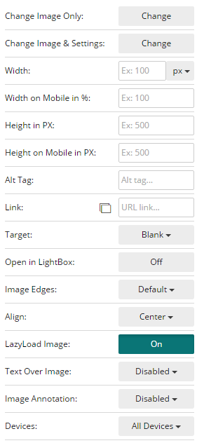
TextThe Text block functions basically the same as a Paragraph block but with a Heading 2 ready to go for faster setup.
AddressThe Address block is a piece of text that is displayed in an address format: Great for quickly adding your address on a webpage. Company Name, Inc.
200 Folsom Ave, Suite 600
San Francisco, CA 94107
P: (123) 123-7890
BlockquoteA Blockquote block is used to separate certain text from the rest of your content. These are commonly used for "Quotes" that is being referenced or for important information that needs visual separation for emphasis.
Unordered ListAn Unordered List block is used for displaying "Bullet points". Commonly used for organizing a list of items like a Grocery or Shopping list. Unordered lists can be set to be "Unstyled" to remove the formatting, useful if applying your own styles via CSS.
Ordered ListThe Ordered List block, similar to the Unordered List but displays it's contents but adds an ordered character such as Decimal, Alphabet, or Roman Numerals in front of each entry. Ordered lists can also be "Unstyled" to remove formatting.
DescriptionThe Description block is best described as a series of matching statements. The first line of each pair is the "Term" and the second line is the "Description" of that term. It is best understood by example: - Description List
- A description list is perfect for defining terms.
- Cup of Coffee
- A black hot drink
- Carton of Milk
- A white cold drink
The block can be displayed like vertically (Term then Description on their own lines) or horizontally (Term and Description side by side - 1 pair per line). To activate the latter, set the "Horizontal" option to On
TableThe Tables block is great for Tabular Data like statistics and other information. To add, delete, or otherwise manipulate the columns, rows, and cells, right click on the table to open the context menu. Just Mouseover the option with a sideways arrow to see the available actions.
ButtonA Button block is your primary way to create a Call to Action. It can be your "Read More", "View Product", or even "Buy Now". Highlight the button text or use the Source option in the "Floating Formatting" menu to edit the text and link. There are a few specific configurations available for Buttons: - Size: Goes from "Mini" to "Large" - controls the width and height of the button
- Block: Makes the button as wide as it's container when turned on
- Disabled: Makes the button fade out and unclickable when set to be on
ComponentsSocial MediaThe Social Media block is used to quickly link to your Brand's social media profiles like Facebook, Twitter, Google+, and others. You can customize your buttons by changing the Icons Size, Align, and Icon Spacing. Activate a button by adding the link in the box next to the Social Media's name. Button GroupThe Button Group block is used to add a group of buttons to your page. By default, the set of buttons are shown horizontally(side by side) but you can change this by setting the option "Vertical" to On
Button DropdownsThe Button Dropdowns block is similar to a regular button but has an arrow button next to it that you can click to show additional available buttons. You can edit the buttons by the Source button on the Floating Formatting menu. You can also set the Button's options to appear upwards by setting "Drop Up" to On
LabelThe Label block is a block of padded text with borders around it that resembles physical labels. You can control the size by adjusting the "Size" option.
BadgeThe Badge block is a set of buttons with a number inside each. Useful for replicating the look of "Notifications" or as a type of navigation. Activate the option marked "Well" to nest your buttons inside a rounded rectangle that separates it from your content.
JumbotronA Jumbotron block is great for leading content. Consists of a Heading 1 for a big lead statement then a Paragraph of content to continue then finished by a Call to Action link to lead your visitors to a chosen action like "Buy Now". The Jumbotron also has the "Well" option, set this to "On" to separate it from the content around it by adding a border.
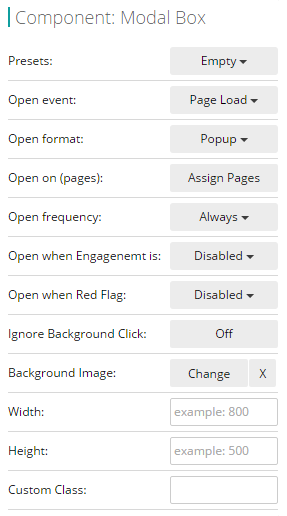
Progress BarA Progress bar block is commonly used to denote progression or a level of completion. Useful for reporting the progress of projects or a level of experience. Adjust the "Percentage" by opening it in the Editor. Activate the option labeled"Striped" to transform the look of the progress bar to have stripes. This gives the bar a more dynamic look. JavascriptModal BoxA Modal Box block is a customizable "Popup Box" container. Click and drag the elements you would like to appear on the popup inside this block. For quick setup, you can choose from the available presets: - Empty: Removes any preset you have chosen
- Email: Sample text with functional Newsletter Subscription box
- Message: Sample text with two buttons - useful for Welcome popups with a Call to Action
- Promotion: Sample promotion banner with functional Sign up box
- Image Only: Adds a simple Image block to the Modal Box
Other than presets there are a number of options available: - Open event: Set when your Modal Box will appear. Can be set to Page Load (as soon as the page is ready), Button Click (modify a button to trigger popup), Delayed (set time), Never
- Open format: Choose wheter Modal Box will appear as Popup or Full Page
- Open on (pages): Select which pages your Modal Box will appear in.
- Open frequency: Configure if your Modal Box will Always Appear, Once per Visitor, or Once per Session
- Open when Engagement is: This ties into our TEA Software and allows you to customize what you show your visitor depending on the level of engagement they are having.
- Open when Red Flag:
- Ignore Background Click: Set to "On" if you don't want the modal box to be closed when the background of the page is clicked.
- Width: Sets the width of the Modal Box
- Height: Sets the Height of the Modal Box
- Custom Class: Name a custom class for use in your CSS
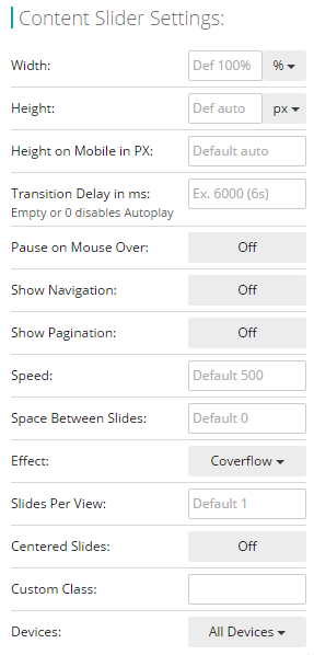
 Content SliderThe Content Slider blocks is a way to add Sliders to your pages. A common use is to add Image Sliders to highlight store promotions or other announcements. You can add any element to each "Slide" layout by dragging and dropping but you would need at least two layout slides to make it work. There are a few options available, namely: - Width: Default Width for the Content Slider
- Height: Default Height for the Content Slider
- Height on Mobile in PX: Sets the Height of your Slider when viewed on Mobile Devices. Used to control the look of your Slide on Mobile devices.
- Transition Delay in ms: Configures the time delay of transition/animation in between slides.
- Pause on Mouse Over: Set to "On" if you want the slide to stay on the current slide when the mouse is over it.
- Show Navigation: Turn this "On" to display Navigation buttons on y our slider
- Show Pagination: Displays the current page on the slide when turned "On"
- Speed: Adjust the speed of your slider. Default is 500. Try lower or higher numbers and dial in on the speed you want.
- Space Between Slides: Sets the space in between your slides. Default is 0
- Effect: Choose the slide animation effect. It can be Slide, Fade, Cube, or Overflow
- Slides Per View: Default is 1 slide per view. Choose whether more than 1 slide will appear at a time.
- Centered Slides: Set whether the slides will be centered
- Custom Class: Type in a Custom Class for use in your CSS
- Devices: Choose if your Slider will appear on Desktop, Mobile, or Both. You can have two Content Sliders, one set to Desktop only and the other to Mobile only if you are displaying different content to each.
 Subscribe BoxThe Subscribe Box block is the easiest way to set up your mailing list form. Signups here go directly to your Backoffice. You can set your form to Redirect on Submit by adding a URL where labeled. You can also choose to Hide Original on Success by turning the option "On". Don't forget to set a "Thank You Message" for your subscriber. TabsThe Tabs block is a neat way to logically organize related content. Directly edit the text on the block, clicking the actual tabs to navigate or you can use the editor to make further changes. AlertsThe Alerts block is a quick way to make announcements or otherwise add information to a page. You can choose the Style preset to be "Default", "Info", "Warning", "Danger". Set "Show Close Button" to hide the "X" button on the alert. CollapseA Collapse block is similar to Tabs in function, it also organizes your content into groups but this one lays it out vertically. Custom Code - SafeThe Custom Code - Safe block is used to add custom code like Javascript, CSS, or HTML that provide special functions usually from third party services. This is the "Safe" version of Custom Code where the code is not rendered on the blocks editing page and only works on the actual page of your website.
Custom Code - DirectThe Custom Code - Direct block is used to add custom code like Javascript, CSS, or HTML that provide special functions usually from third party services. This version directly renders your code on the blocks page and may affect the performance or stability of the editor. This is not recommended unless you have a very specific reason for doing so.
FeederNinjaThe FeederNinja block is used to display feeds generated by FeederNinja.com - You need to enter your FeederNinja ID in the block and click DONE
SnippetThe Snippet block is useful for displaying various codes on your page but not have it rendered or run by the browser. It displays your code with line numbers and syntax coloring for CSS, Javascript, and HTML. You can set this by clicking the setting above the block. ParallaxThe Parallax Layout block is a special block that displays it's content with the "Parallax Scrolling Effect". This makes the image inside the layout move at a different speed relative to the rest of the page creating the illusion of depth and immersion. |
|